Photo via Inc.
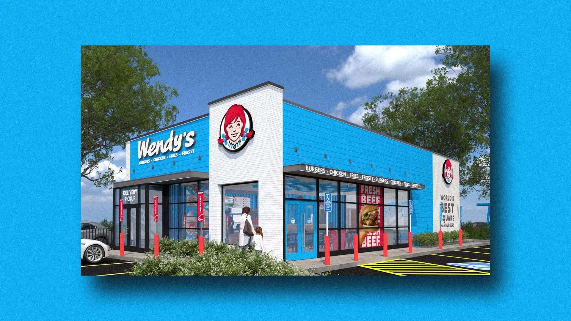
According to Inc., Wendy's is allowing international franchise operators to deviate from the brand's iconic red color scheme, instead offering light blue as an alternative for their restaurant locations. This strategic shift represents a notable departure from conventional quick-service restaurant branding practices, where color consistency has long been considered critical to brand recognition and consumer loyalty.
The light blue design choice carries specific strategic intent: it visually communicates to customers that the location prioritizes digital ordering capabilities. As consumer preferences shift toward mobile ordering and contactless transactions—trends that accelerated during the pandemic—restaurant brands are exploring how design elements can reinforce their technological positioning and meet evolving customer expectations.
For Dalton-area business owners and franchisees, this Wendy's initiative highlights an important lesson about brand flexibility in changing markets. While maintaining core brand identity remains essential, the ability to adapt visual elements to signal operational advantages—such as digital-first ordering—can be a competitive asset. Regional franchise operators should consider how their own brand communications reflect their service capabilities.
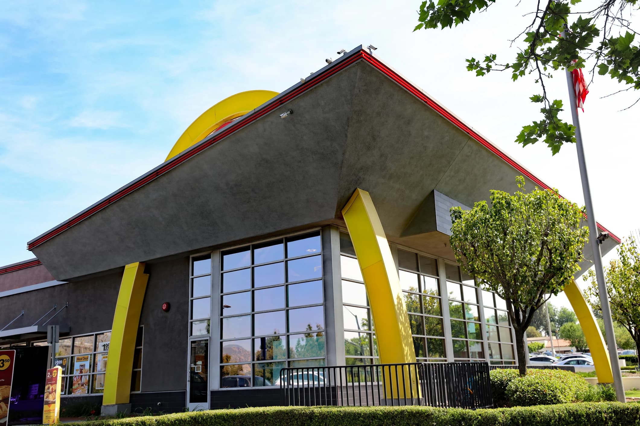
The broader question raised by this shift concerns the relationship between color psychology and appetite stimulation. Traditional fast-food branding leans heavily on warm colors like red and yellow, which are theoretically associated with hunger and urgency. Whether cooler tones like blue can effectively drive sales while communicating modernity will provide valuable data for the entire restaurant industry as it navigates post-pandemic consumer behavior changes.